• ODT Gun Show & Swap Meet - May 4, 2024! - Click here for info

Feedback Needed on logo for new boresighting app

Which logo and which name do you prefer?


  • Total voters
    18

Lessy2020

Default rank <15 posts
Outdoorsman
0   0
Joined
Aug 13, 2020
Messages
12
Reaction score
3
Location
Rocky Ford, GA
I am looking for feedback on a logo and name for a cellphone app and smart gear that work in unison to determine boresight. We are in the final stages of brand development and plan to choose one of the following logos and new name based on responses.

What will the app do?

The app will work with a scoped rifle, tactical optics and hunting/sniping scopes. It allows the user to do three things, bore scope in reference to the rifle chamber, store chamber location, and record the sight setting after the rifle is zeroed. You can check the zero any time when the sight setting has been disturbed. We can then recall the sight setting and verify using the rifle chamber.

Please list your favorite logo and include your favorite business name.
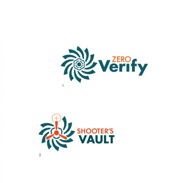
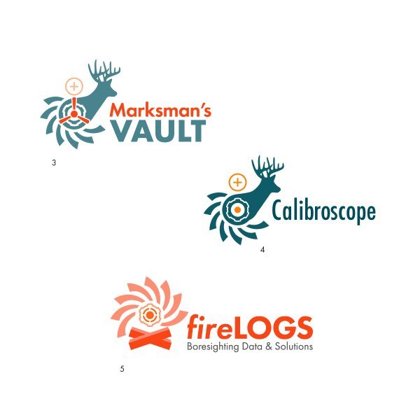
Business names include:
  1. Marksman’s Vault
  2. Shooter’s Vault
  3. Zero Verify
  4. Calibroscope or Calibrosco
  5. Firelog

For reference refer back to Redlegs post on the Record Fire app.
https://theoutdoorstrader.com/threads/bore-sight-zero-record-app-part-2.1847671/
 

Attachments

  • CRITIQUE SCREENS-03.jpg
    CRITIQUE SCREENS-03.jpg
    24.1 KB · Views: 80
  • CRITIQUE SCREENS-04.jpg
    CRITIQUE SCREENS-04.jpg
    31.2 KB · Views: 80
Zero verify is an easy name and gets right to the point of your product. And now for some criticism. Me personally, I do not like any of those logos. Here are the reasons.

1. All are too busy

2. Colors don’t really match up with what your audience uses, think of darker colors like browns, black, tan, something that gets you thinking about the outdoors or rifle scopes

3. The images in conjunction with the colors give a Silicon Valley, nerdy tech vibe. If I saw that as an app, I wouldn’t know if it were for zeroing scopes or zeroing some other type of instrument.

I would keep it simple and elegant. Like black cross hairs with some type of measurement or POI to show zeroing and then a simple logo to the side or below. That’s just me. Good luck with your endeavors. I wish you the best success.
This ^
 

Thanks Jeepnuts. Depending on our survey, we may very well work with a simplified version of the first or second logo symbol.

Symbols 1-2 show rifling, the bore, and target thru the muzzle. Symbol 2 takes it a step further including the line of sight denoted by the crosshairs. Symbols 3-4 take it another step further by showing the deer broadside to the muzzle. Hopefully all is self explanatory otherwise, we need to revisit the concepts.
My eyes did not get “rifling, bore and target” from that image. I got a swirly cute pinwheel flower thing.
 
As far as name, I think zero verify is the best. Logos aren't doing it for me. They are too busy and complex. Closest I guess is the pinwheel logo but that doesn't tell the story visually very well. Keep it simple and bear this in mind.

1). Visually it should tell at a glance what you are all about.
2) it should be simple. Go in with the belief and hope that the product takes off and you get into hard merch, not just electronic format. Towards that end you'll want something that shows well not just on a phone app but also on related products you might sell or at least license in the future. Hunting gear, clothing, shooting gear, general outdoors or even camping stuff. I'm making the assumption you have larger long term goals than just a phone app.
3). Continue to get feedback from the ODT. Fair assumption that many in your current target market are here so the feedback is a great resource.
4). Bear in mind that future products may have some variation off the base theme of the logo. If you stick with a simple core logo, for discussion assume some variant of a bullseye, you may later have that base bullseye in association with another product line logo like a tent to represent camping.....that sort of compound graphic.
5). Just in case you do get into hard products later, silkscreen, embroidery, injection molded, stenciled cerakote.....the simpler it is the easier a time you'll have converting successfully to other media types.
 
Back
Top Bottom